 RAD Radio
 Little Bliss Cakery
 Benjamin's Transfer
 Elite Pool Tile Cleaning
 Ready Mix Drivers
 Fallen Leaf Tree
 Gaming & Leisure
 R&B Protective Coatings
 Brubeck Institute
 UoP Dugoni School
 InfoWorld
 PCWorld
 Macworld
 Hitachi Data Systems
 Sierra Tucson
 CRC Health Group
 NEES
NEES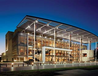 Mondavi Center
 Rinde Eckert
 Air1 Radio




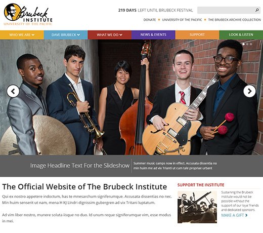
The Brubeck Institute is part of the University of the Pacific. It needed a dedicated web site to promote events, highlight its fellowships, and carry on the legacy of jazz pioneer Dave Brubeck. Working from rough wireframes from the university I created a responsive grid system, visual design, front end HTML, CSS, and JavaScript. The Brubeck Institute web site has helped to create a big impact in the Stockton community and continues to be the hub for all Institute marketing and communications.

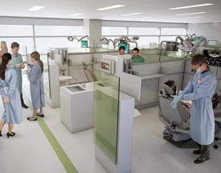
The Arthur A. Dugoni School of Dentistry is a school within the University of the Pacific. They needed to transform their current site to work within the framework of the greater University of the Pacific web site. I was contracted to come up with a design and grid system that would serve both the schools needs and the universities needs. I began with making a wireframe mockup of how the responsive grid system would work. When that was completed I designed the school landing page and several other pages to illustrate how the grid system could be implemented. Currently this project is still in development.
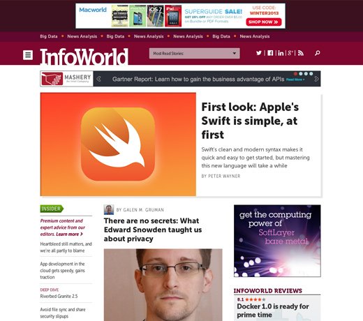
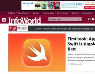
InfoWorld has a long and colorful history as a computing publication aimed at technology practioners. As the visual lead in the InfoWorld redesign I helped take the brand in a new direction by changing the color pallate and typography. This change was made to set InfoWorld apart from the other technology publications and highlight its unique voices. The new site is responsive and spotlights important content in ways the old site never could. After deployment of the redesigned site, traffic increased 19% from the previous months.
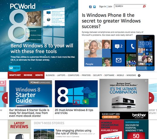
PCWorld is a global leader in reviews and news on tech products, software and downloads. The web site has received over 50 million hits in a single month and now generates more revenue than the print magazine. As Director of Online Design, I work collaboratively with all stakeholders on projects such as homepage and mobile site redesigns. Our goals have been to increase time spent per visit, grow social networking subscriptions, maintain our high organic search ranking, and increase viewer loyalty. A complete PCWorld redesign was launched in October of 2012. Technologies used on the site include HTML5, CSS3, jQuery and Java.
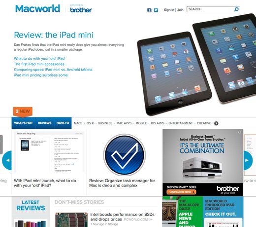
Macworld is the premier source for news, reviews, help and how-to, videos, and podcasts for the Apple market. The coverage includes product reviews for Apple hardware, Macintosh software, apps, iPods, iPads, and iPhones. As Director of Online Design, I lead a small design team in improving, maintaining, and redesigning the web site. Our goals are to grow an extremely loyal audience, increase social networking connections, promote our paid products, produce custom content, and increase our organic search result rankings. A complete Macworld redesign was launched in October of 2012. Technologies used on the site include HTML5, CSS3, jQuery and Java.

I worked as an on-site contractor doing web design and development for Hitachi Data Systems. My primary responsibility involved the migration of the support portal to a Joomla-based framework. Following the business requirements document and the Hitachi Global Web Site Design guidelines, I developed a static HTML mock-up of the new portal. Collaborating with the in-house development team, I helped integrate the design mock-up into the new support portal with custom Joomla templates, modules and components.
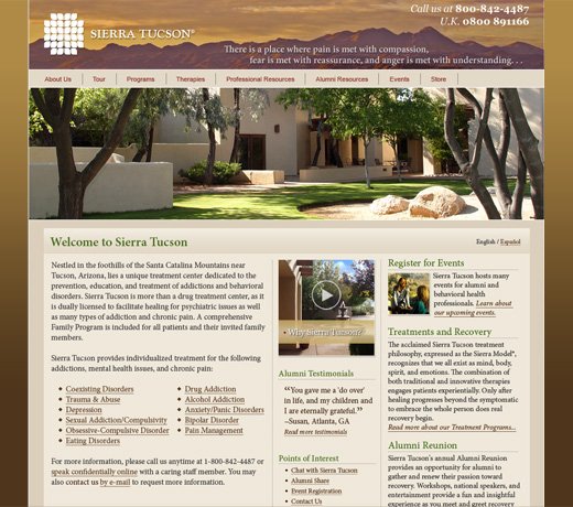
Sierra Tucson is the largest and one of the most exclusive facilities in the CRC Health Group network. Often costing over $30,000 per patient visit, the Sierra Tucson web site needed to better represent the exclusive services it offers, as well as its reputation for clinical expertise. As Web Designer and Developer, I created a creative brief, a site map, design prototypes, coded the interface and migrated the existing web site content. The key design objective was to instill trust in the program, facility and web site content. An example of instilling this trust was to design a very clear navigation system and pair it with a color scheme that highlighted the inviting desert landscape surrounding the facility. Potential clients get a feel for the ethos of the facility and are quickly be able to find information on subjects that may serve their needs.
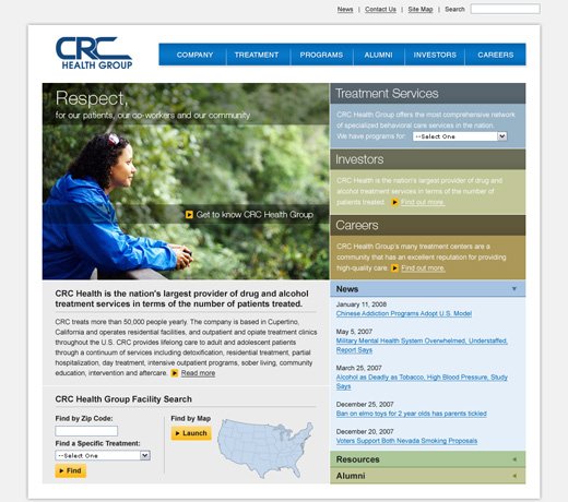
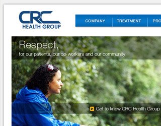
CRC Health Group is largest provider of specialized behavioral health care services in the United States. They treat more than 30,000 people with drug and alcohol addiction, learning differences, weight management issues, eating disorders, and other behavioral issues each day. As a member of the design team, I created this web site design to help transform an informational web site into a portal for potential clients. This was done with a trustworthy and clean design that was intended to guide visitors to facility web sites or initiate a phone call. Another goal was to enforce the CRC Health Group brand through use of color, typography, easy-to-use interface and representative imagery.
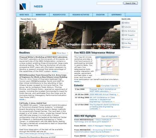
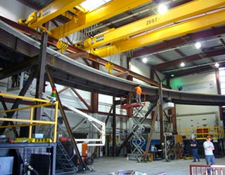
The National Science Foundation created the George E. Brown, Jr. Network for Earthquake Engineering Simulation (NEES) to improve our understanding of earthquakes and their effects. My primary role as Web Designer/Developer was to create a more dynamic and professional web site. This was accomplished by updating the overall design, developing database-driven content and calendars, RSS feeds for syndication, creating engaging Flash animations and improved navigational structure. Technologies used were CSS, PHP, MySQL, HTML, Flash and Javascript.
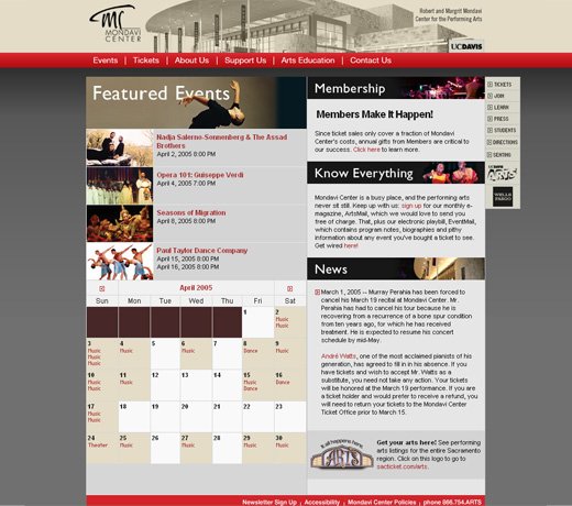
Robert and Margrit Mondavi Center for the Performing Arts at UC Davis needed both a design overhaul and a major technological overhaul. Working as the in-house web designer and developer, these tasks were my primary responsibilities. One of the most important transformations was the normalizing of the database schema. A majority of the old site was using a single, flat database table and a content management system written in the obscure Lasso programming language. I had to recreate the entire database, separating it out into relational tables, and reprogram the web site in a new language. When finished, I was able to add sophisticated features such as a mini calendar of events and series subscription order form that utilized the same data repository. Technologies used were CSS, PHP, Coldfusion, MySQL, SQL, HTML, Flash and Javascript. This was all accomplished while raising the bar of the site's design and aligning it with their current season's printed collateral.
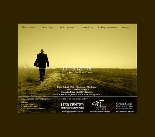
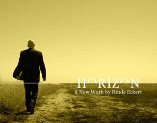
Rinde Eckert is one of the rising stars amongst performance artists. Mr. Eckert was co-commissioned by the Mondavi Center and other performing arts presenters to do a new work titled Horizon. As part of the commissioning, I created a web site for the artist and this project. I developed a logo for the project that reflects its interest in the spiritual and secular worlds. The web site was created to showcase this new work and an online documentary on its development. In addition, it was also an informational resource about the artist.
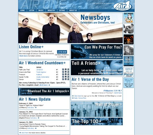
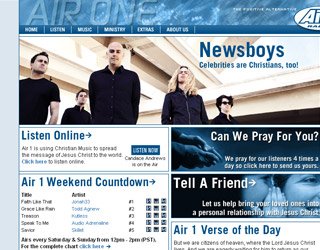
Air1.com was a major interface and aesthetic overhaul from the prior web site. As the Web Designer for Air1, I started the project with a survey of the station's target audience. From this survey I determined the look and feel direction and obtained technical parameters such as screen resolution and Flash compatibility.
After the web site was redesigned it received a dramatic 30% increase in site traffic. Air1.com was voted by the members of the National Religious Broadcasters Association as the most innovative web site for 2003 following the redesign.

Ready Mix Drivers Association was created to help with the recruitment of qualified concrete truck drivers in a high demand job market. I began the development process by first creating a visual identity for the Ready Mix Drivers Association that drew inspiration from our national infrastructure. I subsequently did a custom photoshoot so the images would reflect the authenticity of the groups mission. I then proceeded to create a dynamically driven web site using WordPress that allowed drivers to post their resumes and employers to view potential applicants. Using HTML, CSS, WordPress, Illustrator, and Photoshop I was able to deliver this project in a less than a month.
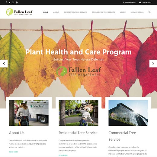
Fallen Leaf Tree Management came to Allroads Digital with a web site that needed to be modernized badly and a desire to also make the site informative. They also wanted to improve their organic search positions for their services in the local communities. I started the transformation process by creating a dynamic and responsive web site design that looks great on every size device. Then I created a SEO content strategy designed to improve their rankings in their core service areas. I also took control on an unattended AdWords campaign that had wasted 36k on unqualified traffic before Allroads got involved. Finally, I implemented full conversion tracking so every form submission or phone call generated from our work was accounted for.
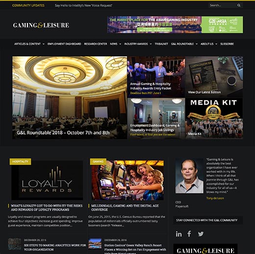
Gaming & Leisure needed assistance with their web site after it had fallen into disrepair and even been the target of hacking. After securing the web site I helped Gaming & Leisure chart a course to modernize their web site. Our stated goal was to create a more immersive design and robust platform for Gaming & Leisure's influential role in the Gaming & Hospitality industry. We not only delivered a sophisticated design, we also delivered detailed video tutorials on how to manage the new web site. A key request from Gaming & Leisure was detailed reporting on web site activities. Using Google Analytics as a basis for data I developed a list of key performance indicators and I tracked that performance over time.

R&B Protective Coatings facility is the largest steel coating and sand blasting facility on the West Coast. Their previous web site had fallen into disrepair and was not mobile friendly. I designed them a new site and provided them an onsite photoshoot. The goal was to show the scale and capabilities that they have to offer while also showcasing that it is still a family owned and operated business. Now when clients visit their web site they can be reassured of the quality of the services they will be recieving.
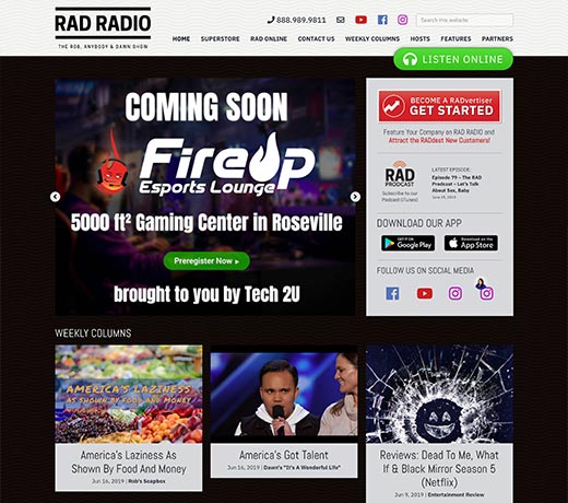
The Rob, Dawn, and Anybody Show is the number one morning show in the Sacramento market. RAD Radio's old site was impossible to navigate and cumbersome to maintain and clunky to make purchases from. I created a modern and flexible design that accommodated their steadily changing content while leaving the layout flexible enough to highlight featured items. I also upgraded the entire e-commerce platform with a system that allows for adding and removing products with ease. In the first year of operation, the RAD Superstore has already sold as much as the previous 5 years combined.
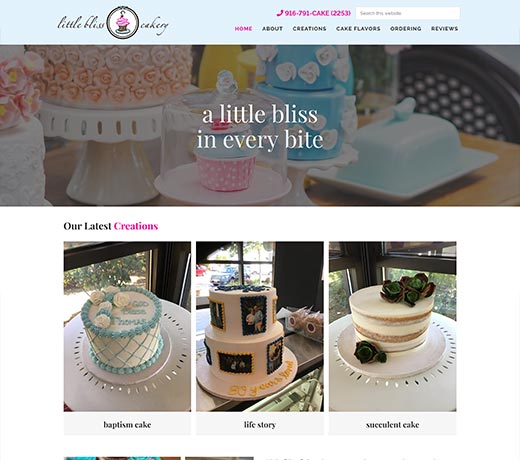
Little Bliss Cakery had an existing web site but no method for the owners to update the content. They turned to my company to modernize the web site's toolset and organize the hundreds of custom cake creations. I created a method of cataloging their custom cake creations and an easy process for a potential customer to order a similar desert creation. In addition to the organization, I added a search tool that would index every cake so even the busiest parents wouldn't have to spend extra time looking for only a Ninja cake.
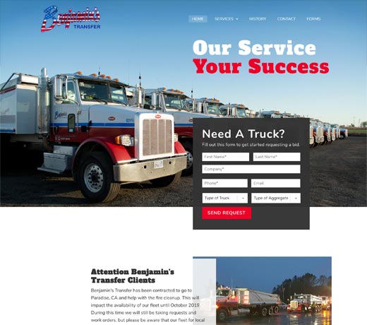
Benjamin's Transfer had a web site that was not mobile friendly and could not be updated by its staff. It also had outdated information and service offerings. I developed a site with quality images, coherent branding, and a user-friendly way to contact their offices. We also did a professional photo shoot so all the trucks reflected on their web site represent the current fleet. For SEO purposes we created individual pages for each trucking service they have to offer.
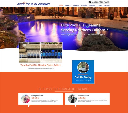
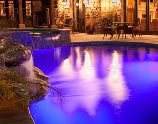
Elite Pool Tile Cleaning had a web site that they could not maintain and did a poor job of reflecting the benefits of their process. I created a new site that had dramtic before/after sliders and an easy to manage portfolio. We also incorporated tasteful animation into the design to spotlight content and calls to action. I also added a feature on the contact page so potential customers could upload images of their pools for an estimate.